I think this is a really good example of how animated text can move in time to sound effects/music.
15/12/2009
07/12/2009
Animatics
Animatics are animated video storyboards. Think of them as taking the art of storytelling a step beyond storyboards; breathing life into drawings through motion and sound.
Here is an example of a coca cola advert animatic.
Here is an example of a coca cola advert animatic.
Storyboards
Storyboards are basically a sequence of images or drawings that describes the planned content of a film or video. These are a good way of visualizing ideas for motion graphics and organizing with the allowance of error and change. In film production the director would work with a graphic designer to visualize a sequence first before filming, this is more time and cost effective.
A bit like comics storyboards are made up of frames, each frame contains only the essential, clear objective (ie the outline of a figure and indication of the movement and perhaps idea of lighting)
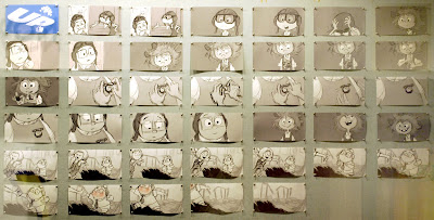
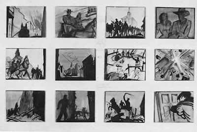
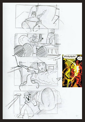
A bit like comics storyboards are made up of frames, each frame contains only the essential, clear objective (ie the outline of a figure and indication of the movement and perhaps idea of lighting)


02/12/2009
After Effects Lecture
After Effects is a program, similar to Indesign it is used to create an arrangement of other files i.e photoshop, illustrator etc. however instead of a book it creates a motion graphics for film/ DVD.
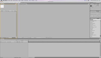
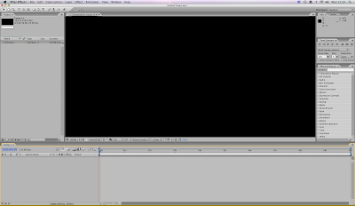
This is the After Effects environment, it is divided into panels, they work in the same way as 'pallets' do in other software. The panel in use will gain a yellow boarder, these can be resized with click and drag. Everything created in AE is called a project (.aep)
The panel on the far left is called the 'project panel' this contains files which are in use with in the project.
The large central panel is called the 'composition panel' this is used to arrange and preview work.
The final long bottom panel is called the 'timeline panel' used to arrange assets placed in time.
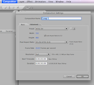
Firstly you need to create at least one COMPOSITION. Then pick the right preset appropriate to your project. The two main presets are NTSC (used in America and Japan) and PAL (used in UK and Europe). There is also the choice of HDV, a high deffinition standard. As I am in the UK and will be wanting to burn my final motion graphics onto a DVD I am going to stick to PAL for this project.
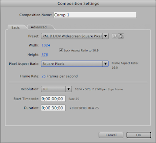
For motion graphics it is appropriate to use square pixels. If i were to be using video it would have to be widescreen or another available option.
The pixel aspect ratio are the different shaped pixels, I'll be sticking to square.
Also the PAL standard is 25 frames per second.
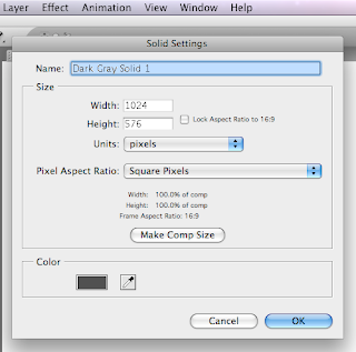
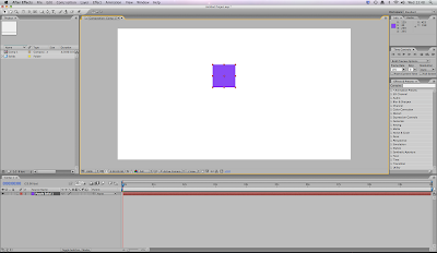
Similar to photoshop, AE also makes use of setting work out in layers. Each element of the composition occupies their own layer. For example this purple square can be placed.
To the right hand side of the screen are time preview controls. If you have a large, complicated motion, for best preview results click the RAM preview button, this will render and calculate each frame to play in 'real time'
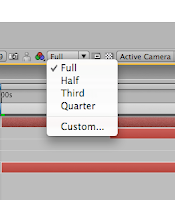 composition settings change the resolution so you can easily preview motion.

With this tool you can 'cut off' a work area so preview will only play that section.
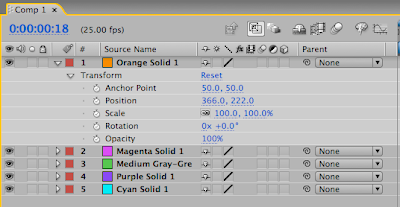
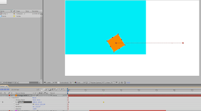
Every layer has transformation properties here is an example of how to create a motion path
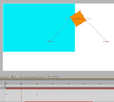

This is the After Effects environment, it is divided into panels, they work in the same way as 'pallets' do in other software. The panel in use will gain a yellow boarder, these can be resized with click and drag. Everything created in AE is called a project (.aep)
The panel on the far left is called the 'project panel' this contains files which are in use with in the project.
The large central panel is called the 'composition panel' this is used to arrange and preview work.
The final long bottom panel is called the 'timeline panel' used to arrange assets placed in time.


Firstly you need to create at least one COMPOSITION. Then pick the right preset appropriate to your project. The two main presets are NTSC (used in America and Japan) and PAL (used in UK and Europe). There is also the choice of HDV, a high deffinition standard. As I am in the UK and will be wanting to burn my final motion graphics onto a DVD I am going to stick to PAL for this project.

For motion graphics it is appropriate to use square pixels. If i were to be using video it would have to be widescreen or another available option.
The pixel aspect ratio are the different shaped pixels, I'll be sticking to square.
Also the PAL standard is 25 frames per second.

Similar to photoshop, AE also makes use of setting work out in layers. Each element of the composition occupies their own layer. For example this purple square can be placed.

To the right hand side of the screen are time preview controls. If you have a large, complicated motion, for best preview results click the RAM preview button, this will render and calculate each frame to play in 'real time'
 composition settings change the resolution so you can easily preview motion.
With this tool you can 'cut off' a work area so preview will only play that section.
Every layer has transformation properties here is an example of how to create a motion path


01/12/2009
New Module
Through out this module I am going to be investigating the question 'what is design for digital media?' This includes Passive media such as Motion Graphics, flash animation, film and TV. Also interactive such as web/Internet, Games, DVD's, TV and touch screen. I'm inexperienced in all these areas and so have a lot to learn, however can't wait to get started :-)
To kick start this module, the first brief is to produce a silent movie based on a word from the randomiser. (open, fold or tick) I am hopefully going to produce something along the lines of these videos i found on youtube.
To kick start this module, the first brief is to produce a silent movie based on a word from the randomiser. (open, fold or tick) I am hopefully going to produce something along the lines of these videos i found on youtube.
17/11/2009
What to make the box out of?
13/11/2009
Flexo printer
The main packaging for this project is a strong cardboard box, I have been looking into possible printing processes that would be suitable. I firstly considered Litho however after finding the stock would have to bend trough rollers, i realised it was an un sutible method for my stock.

I then found the Flexo press. This is the best printing method for my project because the press is designed to print onto cardboard either on sheets or boxes already mounted. It can also be used in the bag industrey (woven PP bags, paper, jute sakcs...) and many other forms of packaging.
Example of a four colour flexo printer.

08/11/2009
Obey the Siberian Husky
During WWII, Sibes served valiantly in the US Army's Arctic Search & Rescue Unit of the Air Transport Command. Since then, they have continued to gain influence in the government and global politics, and according to Whitehouse Intelligence, are close to launching their diabolical World-Domination plot.
What pet to get?
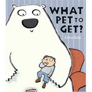
In this story, Jack wants a pet but he can’t decide which one to get. While his mother isn’t really listening when she agrees to let him get a pet, she starts paying attention when he suggests getting an elephant, a lion, or even a Tyrannosaurus Rex. For each animal, she has a convincing reason why they shouldn’t get it. Finally they find an animal they can agree on – a little dog. Readers and Jack’s mom are in for a funny surprise.
This sweet storey is on the similar lines of what my project is based on.
04/11/2009
Running dog
I've been trying to learn how to draw (in proportion) active, running dogs. This animation has been helping to get the right shapes.
Sports packaging (To improve your health lifestyle, get a pet)
I have started to look at some existing packaging that is designed to appeal to those wanting to be 'sporty, energetic, fun and stylish.'
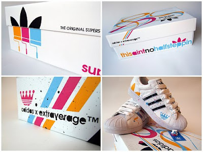
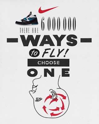


Keep dog walking !
My packaging would appear similar to these designs however the logo would be design to use dog and walking imagery (not trainers, sports equipment or other band names).
Different shapes of packaging and their nets
So far my design would be printed onto a 'shoe box' sized box. I would design the net to fit onto perhaps a A1 size of material (I'm thinking, a thick cardboard or plastic at the moment, i will do research) the out line would then be trimmed and simply bent into the box shape.
The design could also be mass printed on to a roll of the chosen material.
22/10/2009
20/10/2009
Pet Packaging
These are great! good design and very useful!
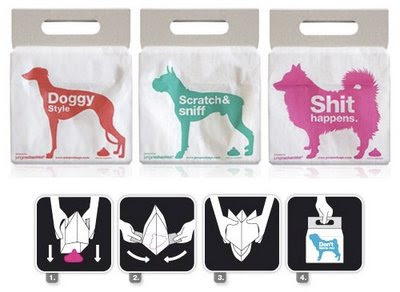
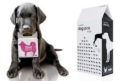
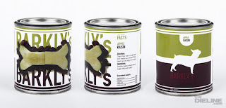
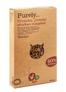
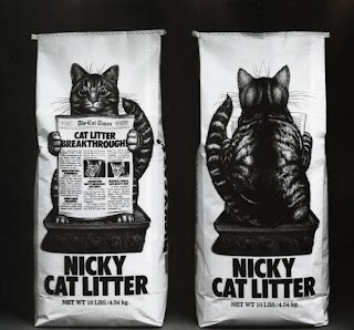
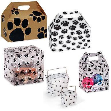
After a bit of research into packaging to do with pets. I have noticed that paw prints seem to be very popular.
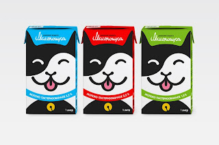
Kazakhstan-based graphic designer Azamat Sayfullaev created the concepts for "Собачкина" & "Кошкина радость" - pet food packaging.
I know this packaging for gorilla new york coffee has nothing to do with pets. However I think the image is striking and the simple use of two colour print makes the packaging really stand out. key to attracting sales.
I could apply the same image technique the pet packaging concept.
Subscribe to:
Comments (Atom)


